
PENNY
We noticed an opportunity to use pennies to bring joy to our friends. I started by running two experiments to understand why people are attracted to the idea of token value. The team iteratively designed and tested both paper and screen-based prototypes, learning that users above all desired an out-of-the-box mobile experience. In the end we created an InVision prototype for Penny: a mobile app focused on sending pennies to friends.

Project Breakdown
SCOPE
8 weeks
4 person team
MY ROLES
UX researcher
Interaction designer
Concept creator
SKILLS
Experimental design
Click through prototyping
Screen design
Wireframing
TOOLS
Figma
Firebase
Invision
Pencil + Paper
Sketch
A new Chapter for the Penny
Let's face it. I don't like pennies, and you probably don't like them either. Heck, Canada even got rid of their penny entirely. So when a friend picked up a penny from a NYC street while walking between venues at Interaction 17 and handed it to me, I was pretty confused. He giggled, thinking it a silly joke.
For no apparent reason, we then had the sudden urge to give our third friend, walking beside us, a penny...on Venmo. Fortunately, she received a notification; used to our silly jokes, she looked at us funnily, and we laughed at the joke. Word got out around our masters' cohort, and soon after, many people were sending pennies to each other, with silly messages like, Penny for your thoughts? or This is what you’re worth to me. Every time, laughter would ensue, and people felt good about the interaction.
It got me thinking: isn’t a laugh worth a few seconds of time? And maybe even a single cent of my money?
User Research
As the research lead for this project, I immediately set out to test our assumptions about why our app idea would work before we began to design it. Our idea different from viral memes in that pennies have actual monetary worth, so it was crucial to understand whether or not users actually derived additional enjoyment from the value aspect.
Pennies versus potatoes
To test the value variable of the Penny idea, we recruited five users to participate in a two part study. People sent pennies to five of their friends on Venmo, as well as a picture of the Kawaii Potato meme to five of their friends on a messaging app of their choice.

We found people preferred sending pennies for a few reasons:
"The message of one cent is universal to me."
"I like the trolling factor of sending a penny."
"Pennies have an actual value."
Giant pennies
I also wanted our team to experience the reactions of giving token gifts to friends. We designed and printed gigantic "pennies" and surprised friends with them. People were understandably excited about receiving a cute gift, but the ensuing conversations that happened as a result were the real takeaway. We saw an opportunity to use pennies as a way to start a conversation that might not otherwise happen between faraway friends.

Ideation
Storyboards
We came up with storyboard to represent the most promising use cases:
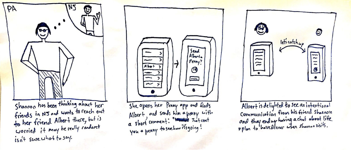
Connecting with old friends and maintaining relationships
Breaking the ice with new friends
Just for fun or to be a troll

ER diagram
Initially we had hoped to code a prototype of the app. A teammate and I sketched out an ER diagram that related the things users liked about sending pennies to an element of the app's functionality, and what would consequently be stored in the app's database. This exercise also helped me understand how devs view an app's creation, especially if we were to hand Penny off to one.

Paper prototypes
We started out with a paper prototype of the app. Through three versions of user testing, we quickly realized we were overcomplicating interactions, and focused on getting users to do what we hoped they would do - send pennies.
Screen design
Medium fidelity prototype
After simplifying the app's functionality from our low fidelity prototypes, we tried some different colors, patterns, and layouts for app's design.

During user-testing, participants still noted that the onboarding process was very long. In other words, people knew they were there to send pennies, so they wanted to send some now, and then figure out the app along the way. These tests reinforced to us that we needed to keep Penny really simple.
Style Guide
A teammate and I worked on the style guide for Penny. We wanted to stay true to the bronze color pennies have, but also contrast it with some powerful, fun colors. We cycled through multiple iterations of colors (as seen in above wireframes), but settled on a mix of oranges and greens.

Final designs
Our final prototype took into account the many rounds of user testing we'd done to promote an out-of-box experience, and get people sending pennies as quickly as possible.


With this core functionality in place, there's now room to expand Penny's capabilities.
FINAL TAKEAWAYS
The design space for our app is very broad. Even though we scoped to sending pennies amongst friends, this implementation is by no means the only possibility. My favorite: What if users could send pennies to their favorite charities? Or donate pennies on behalf of friends? Just think, a million users each donating a penny a day...