

BLOOMBERG: B7G
People with visual impairments (PWVI) are at a huge disadvantage in finance. Bloomberg LP asked us to help close this gap by making financial visualizations more accessible. Throughout Spring 2017, our team of five designers started by becoming fluent in accessibility design through speaking with subject matter experts and undertaking a review of relevant literature. We then conducted contextual inquiry interviews with PWVI, as well as with sighted financial professionals to understand their workflows and pain points. We presented our findings to Bloomberg in our spring research book (which I designed!) This summer, working at Bloomberg HQ in Manhattan, we began by creating and testing twelve low fidelity prototypes with Bloomberg employees. We've now scoped our design process to focus on creating a system that allows for better control in data navigation and context in data understanding.

Project Breakdown
SCOPE
8 months
5 person team
Masters' Capstone Project
MY ROLES
UX researcher
UX designer
Visual designer
SKILLS
Affinity diagramming
Print design
Prototyping
User interviews
TOOLS
InDesign
Keynote
Pencil + paper
Sketch
Note: this project is a work in progress. Our team is currently working at Bloomberg HQ in NY until August 2017 designing, prototyping, and building solutions. Right now we're in the high fidelity prototyping stage, as our final product is beginning to take shape. Stay tuned!
STORY
IMAGINE...
You have to make an investment decision based on an untitled image you can't see. Listen to a bit of this audio clip and make a buy or sell decision.
This is how much of the table the audio clip above reads.
This is a visualization of that table.
As this example illustrates, people with visual impairments (PWVI) are at a huge disadvantage when it comes to making decisions like these, be it in a professional setting, or when managing personal finances.
For our masters' capstone project, we were asked to explore the domains of finance and visual accessibility, with the goal of giving PWVI better access to financial visualizations and other information. The first step was to quickly become experts in designing for accessibility.
UNDERSTANDING THE PROBLEM SPACE
Project Kickoff
We met with Bloomberg in NYC to make sense of the problem space. As a group, we noted:
- “Bloomberg’s products provide too much information, making it difficult for visually impaired people to get to the “nub” of the data.”
- “Sighted people are privileged because financial tools are designed for them.”
Through some design exercises with Bloomberg, we came to three major research questions:
- How do the mental models and workflows of PWVI differ from those of sighted people?
- How might a non-visual tool benefit different audiences?
- What financial data is essential for decision-making?

Subject Matter Expert Interviews
To begin understanding the complex space of accessibility, data visualizations, and expert finance decisions, our team interviewed ten subject matter experts (SMEs). Our interviewees ranged from accessibility and emerging technology academics to finance and accessibility industry professionals.
Empathy Exercise
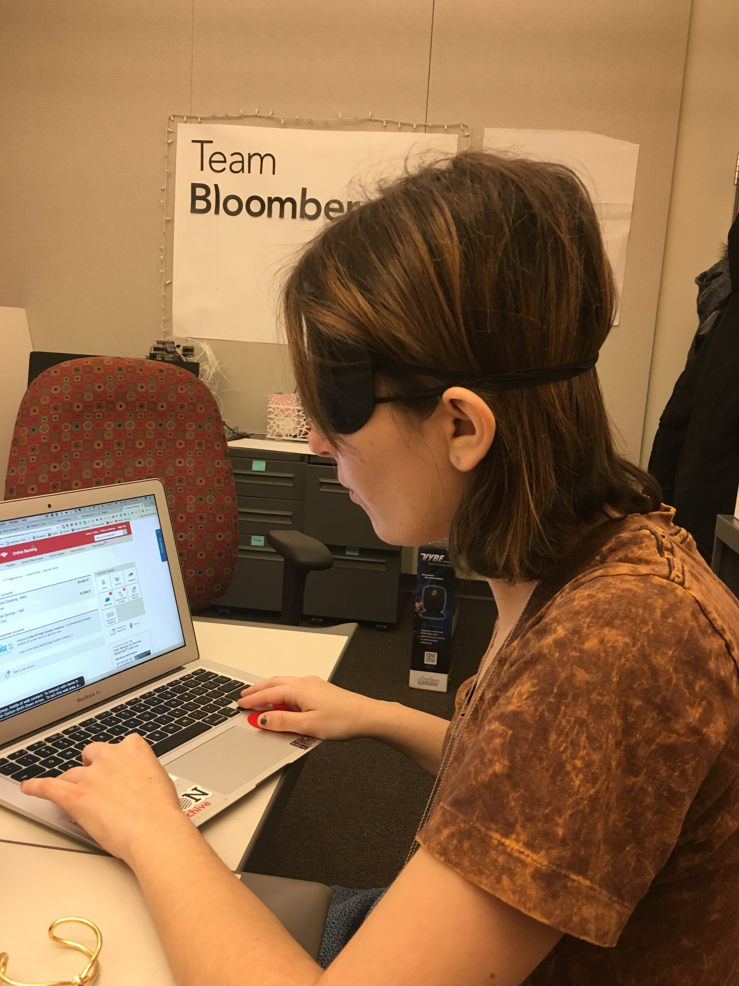
As a team we felt it necessary to try to put ourselves in the shoes of PWVI. However, it was important to develop empathy specifically in the context of our research, rather than just simulating blindness. After doing research on empathy exercise design, I wrote an experimental protocol. In this exercise, we first learned the basics of the Apple Voiceover screen reader, and then used it to navigate our bank accounts on both our laptops and iPhones.
Literature Review
Our team split up some 60 research papers on accessibility, cognitive science, data visualization, and emerging technology. Every week, we conveyed our findings to each other and developed a shared understanding by printing out discrete points of interest onto individual notes. We then clustered these notes to see what themes emerged in each research space. We digitized these higher level themes into the clusters shown below (click to enlarge!)
Secondary Research Report
I designed our secondary research report, which we presented to Bloomberg. I was also responsible for the following five key insights with respect to PWVI:
“Don’t move my stuff.”
Spatial representations of an interface or an environment work well, but only if things stay exactly the same. Even small changes are detrimental.


“I want to use the same stuff as everyone else.”
PWVI don’t want to stand out any more than necessary.
“Don’t fix what isn’t broken.”
Learning new technologies takes a great deal of time - leave PWVI the opportunity to leverage their existing skills.

“So what product are you making?”
PWVI have a tendency to approach user studies with the mindset of testing a final product, as opposed to talking about research, or giving feedback on a prototype.

“I do a lot of additional work others don’t know about.”
The concept of invisible work inspired our team: a PWVI necessarily conducts additional work to create an accessible space.


Contextual inquiry
Contextual interviews and interpretation
We scheduled remote and in-person interviews with 10 PWVI: five with congenital blindness, and five whose vision declined later in life. We observed how our interviewees accessed financial data in real time, and asked them to recount recent interactions, as well.
We also talked to six finance experts who actively manage investments about their workflows, as wells their use of data and visualizations for decision-making.

One PWVI interviewee customizes his bluetooth keyboard with tactile stickers to find his place while typing.
After each interview, three team members interpreted notes and recordings, then created visual models of the workflows to capture how they follow the information scent.
Affinity Diagramming
We combined all of our notes from our interpretation sessions, color-coding them based on whether they came from PWVI or sighted finance experts. We were excited to see overlap between the two domains, suggesting that both groups faced some similar challenges.

Ideation
We spent several sessions “walking the wall,” annotating the affinity diagram with questions, breakdowns, and design ideas. From here, we began ideating on possible solutions. As part of this process, we also created early prototypes to explore the forms of potential solutions. We also considered the feasibility of our top design ideas, and the impact they would have on PWVI and sighted finance professionals (click each image to enlarge.)
A list of design ideas generated by “walking the wall” of the affinity diagram.
Design ideas plotted in terms of difficulty of implementation and solution impact.
An early prototype for a dynamically generated tactile chart, mocked up with foam core and straws during a rapid prototyping session
Presenting our research
We explained our research to Bloomberg in our spring book and presentation, entitled “What Am I Missing?” We offered six insights, told from the perspective of a PWVI:
People who help me are interfaces too.
The transfer of info by a sighted person is subject to that their interpretation and expertise.
My assistive technology only provides one piece of information at time.
It’s hard to view all parts of the puzzle at once because screen readers only provide one piece of information at a time.
I use charts as a communication tool.
Highlighting visual cues in charts is the easiest way to justify investment decisions.
There is no normal.
Both PWVI and finance experts depend on their idiosyncratic workflows to get things done.
Changing technology is difficult, so it better be worth it.
A product must offer a meaningful improvement to justify altering a hard-earned workflow.
I use visuospatial metaphors as mnemonics.
Visual and spatial references help bridge communication between sighted and blind colleagues.
I designed the book and adopted a style guide with high contrast colors for visual accessibility.
Prototyping
Low fidelity prototyping
We created twelve low fidelity prototypes ranging from a CUI and a scripting language, to improved haptic graph navigation and simple earcon (auditory icon) languages. We tested these prototypes on each other and on Bloomberg employees to solve early usability issues.


Medium fidelity prototyping
Through the Rose-Bud-Thorn design exercise, as well as a 2x2 impact-feasibility matrix, we settled on increasing accessibility to candlestick charts. From there, we sat down with application specialists at Bloomberg to better understand how finance professionals use these charts, and further test our assumptions about their utility. We found that a major value of candlestick charts was that they pair well with different studies that bring context to a stock chart. From here we wrote out a primary task that illustrates how people use these charts.
We created three different navigation systems (keyboard shortcuts, dial, tablet scrubbing) used to access information on a low-fidelity UI. Each was equipped to traverse a set of data, give information about the open/high/low/close value of that day, and jump around to significant points of interest calculated using a Bollinger Band study. In the video below, one of our teammates demonstrates the dial version of our medium fidelity prototype.
User-testing
We tested these interfaces with six people who are blind. The scrubbing interface was scrapped, as it fared very poorly in these sessions. The dial interface got the best reviews from our participants, but ultimately, the results didn't justify the negative ramifications of asking somebody to buy new hardware, as our research insights suggested. Keyboard shortcuts made the most sense to tentatively develop because every Bloomberg employee or client already receives a Terminal keyboard, so there is no added monetary or social cost required.
Next Steps
High fidelity prototyping (in progress!)
As we continue with our final prototype, we're refining our primary task. This process will help define what our system should handle, as well as help us iterate on our user-testing protocol. We've reframed the scoping decision to candlestick charts as trying to design for financial professionals who are blind. As such, we're focusing more on the context-enabling studies professionals use to bring more meaning to line and candlestick charts.
Current primary task - click for the full image!
Accessible Website
To accompany our final product, we're designing and building an accessible website. As the visual/interaction designer for the site, I'm working on wireframes of minimal, clean design that arise from an underlying HTML structure that is well-organized, with obvious skips.
Team B7G is currently in Manhattan at Bloomberg HQ for the summer. Stay tuned as we continue designing, prototyping, user testing, and building!